The first project given to us is to look at the world with a different eye and from a different perspective, looking at objects in more depth. We’re required to go around and create the alphabet up of photographs. However, the alphabet cannot be created out of pre-made letters for example, signs and names. This means we’re required to look into nature and man made objects which look like the letters in the alphabet, without that being their sole purpose. I have made a list of what I am planning on looking at when I complete the photography aspect of this project. This list will help me focus on what to look at when photographing rather than looking high and low randomly, my thoughts and eyes will be more focused.
Ideas on what to photograph:
- lamps, lampposts, road signs, traffic lights, cones
- buildings, roads, statues
- trees, bushes, plants, flowers
- shells, sand patterns, rocks, sea-life
- cars, wheels, bikes, trucks, bushes, planes
- benches,chairs, stools
- air balloon
- pots, pans, utensils
- swings, monkey bars, climbing frame, seesaw, roundabout, spiderweb swing, slide
- wildlife
I felt that using the internet I would get some help and a clearer idea of what I wanted to photograph so I typed into google ‘Alphabet Photography’. I felt that the website http://www.alphabetphotography.co.uk/ was incredibly helpful as it has photographs which were highly relevant to this project we have been given.
Now I feel like I am prepared I feel that it is a great time to go out and take photographs. Me and Abbie Norris are working together on the photography part of the project as we were informed that we were allowed to partner up for this first project. We’re going to be meeting up at Asda late afternoon and then hopefully get all the photographs we need that afternoon/evening.
The photographing went incredibly well, we met up and Abbie brought a couple friends to also keep an eye out for letter we needed. This was it sped up the time period and it meant that we could all make friends as a little group. With four of us keeping an eye out for letters it didn’t take long for us to find all the letters we needed. It took us less then 3 hours to find all 26 letters. I also felt that it was a really fun and enjoyable experience as it meant I got to know the town of Bournemouth more, I made friends and I also looked more in depth at what surrounds me everyday. We took a wide range of photographs and I feel that it went very well as I made sure that we took at least 2 photographs of every letter that we found to ensure we got the best photographs possible. However, this wasn’t the case for about 3/4 letters as we quickly found another letter and it was a bit of a rush.
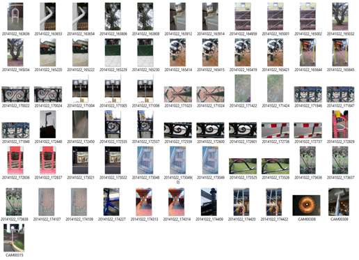
Here is the contact sheet for the photographs that we took. We took 67 photographs in total. I honestly prefer to take more photographs than needed to ensure that I don’t miss anything and then don’t have to go back to retake photographs as it wastes a lot more time.
In a Photoshop workshop lesson with Kyle, we learned all about the best way to layout the photographs on a page. This workshop lesson was incredibly helpful as it helped my touch up my knowledge on Photoshop as well as learn a few new things. It was a really enjoyable workshop and truly needed.
I decided that I wanted my final piece to be a little different and unique from everyone else’s final pieces. It took me a while to figure out what I wanted to create. I heard previously that someone placed the alphabet on a keyboard as if it was real and I liked that idea but I wouldn’t recreate that as it wouldn’t be unique and my own work. After thinking about it for a while I decided that I would take a photography of a picture frame on a wall. Crop the photograph and then duplicated it 26 times so it looks like a wall covered in 26 picture frames. Making this black and white was a personal touch as I love black and white photographs. I also felt that doing this would make the overall picture more neutral. I personally love black and white pictures as they show shadowing and depth more than a picture which is full of colour. This also helps with a project like this as having a black and white background helps prevent a distraction from the main part and interest in the final piece. Before I added the 26 photographs into the 26 photo frame slots I Emphasized the letters in the photographs to make it more obvious what the letters were meant to be in case there was any confusion over what they’re meant to be. I stuck to the conventional order of ‘abcdefghijklmnopqrstuvwxyz’ to also prevent confusion over what the letters were meant to be. My final piece is as shown:
Personally I am really proud of this mini project as it flowed very well and I really enjoyed the whole project. I may have gone into a bit more depth than I should have but photography from an art & design aspect is a passion of mine and something I really enjoy as I studied it at A level. Completing this project took me back to doing this on a much bigger scale doing my A levels which has been incredibly enjoyable.
